A path to a new design
Arthur Desaintjan spent 6 months with us from 2025-02 till 2025-08 for a web UX design internship (Master Design, University of Strasbourg). In this post, Arthur writes about one of the many projects he worked on: (re)designing Gephi Lite. Through this process he shaped the new Gephi Lite interface which will be released soon in 2025 autumn.
We’ve been working on Gephi Lite for a few years now. Our intentions have been from the very beginning to leverage web technologies to bring a clear and light network visualisation experience. Yet crafting those intentions into an efficient User Experience is not easy. Above all when you’re a team of three engineers, even with experience in designing complex user interfaces. That’s why we felt we needed to step back and invest some time on Gephi Lite’s usability. Arthur dedicated a large part of his time with us to work on that. A great way for everyone to practice and learn.
How is Gephi Lite used?
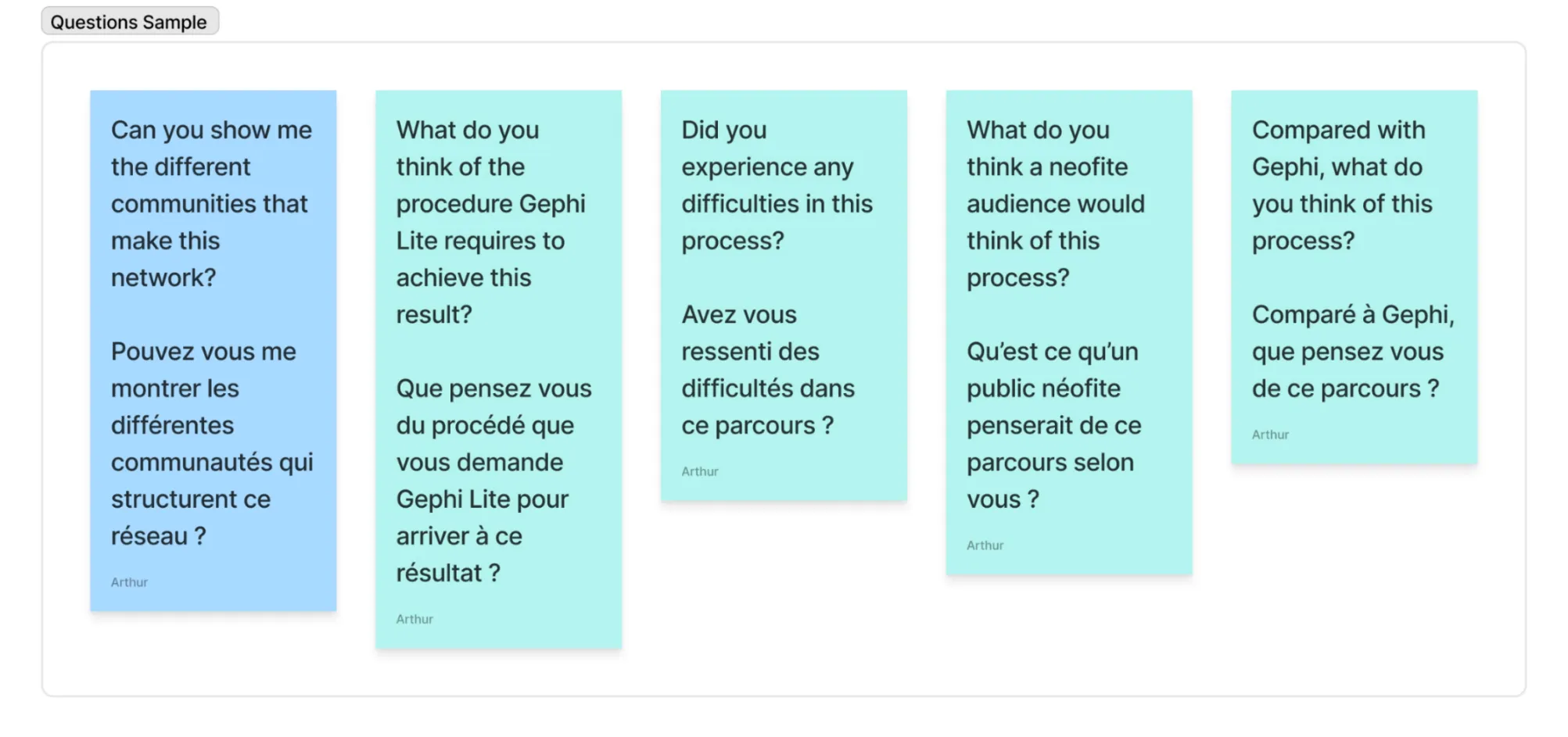
To improve it, we needed to know what felt wrong, and at this time we didn’t know how people felt about Gephi Lite. We had made some design choices out of intuition and conviction, and wanted to face how they were truly received. We wanted to know more about existing (or potential) users of Gephi Lite, to look at the way they put their hands on it, next to Gephi, and look if its interface helps or fails our users.
To do so, we organized a range of qualitative interviews and tests on Gephi Lite. As expected, they have been very insightful. Thanks to them, we collected feedback on the interface’s problems, and had the chance to better understand our interviewee’s needs and habits.

Addressing main problems: menus and attributes
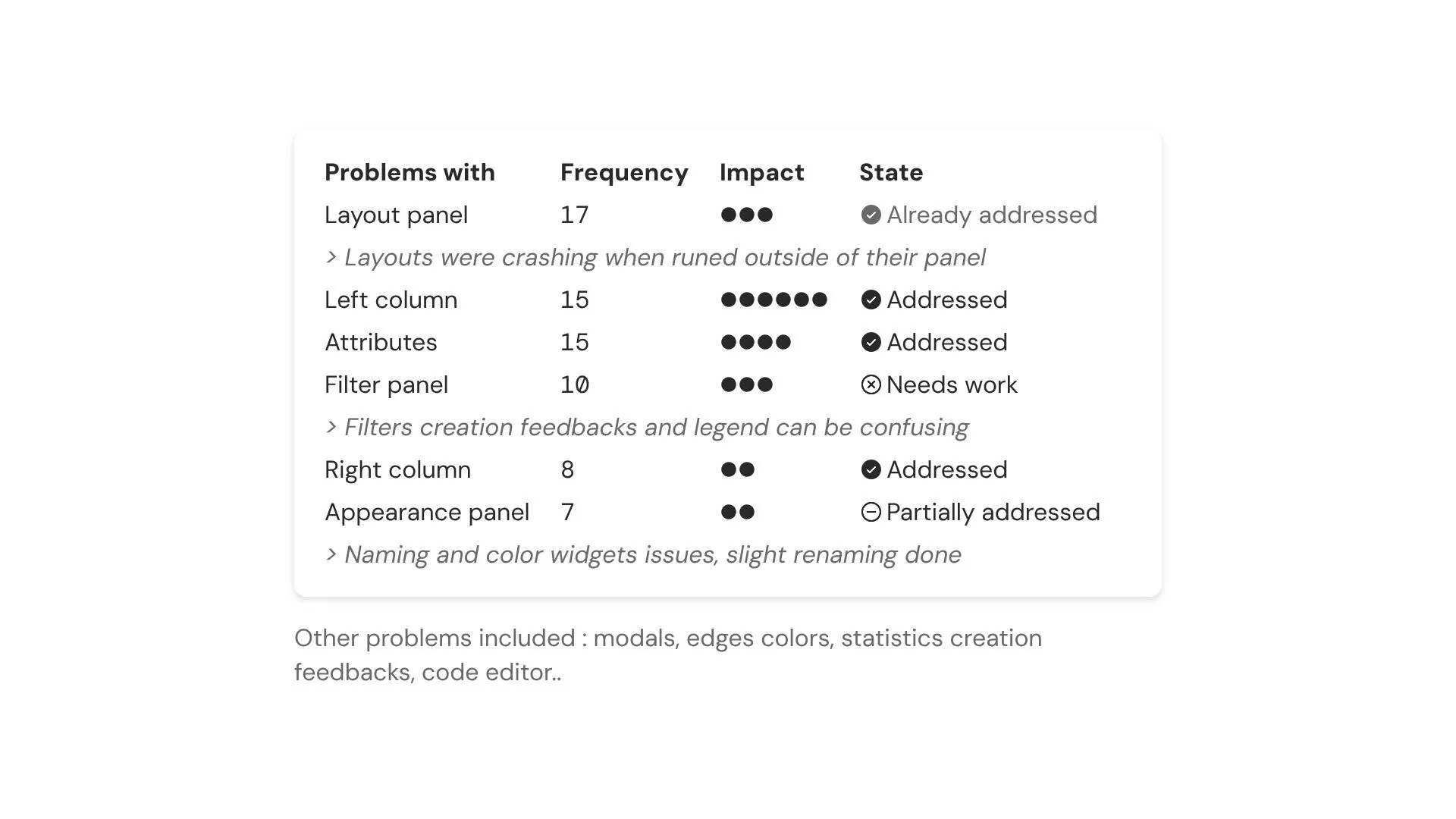
Gephi Lite menus came out to be very problematic. The left-hand column was difficult to navigate. The icons on its tabs weren’t understandable. Frequently used features such as layouts were hard to find or to go to. The right-hand column was clearer, but empty for its size, and then it felt in the way. Overall, finding things in Gephi Lite’s menus was either difficult or a bit time-consuming.
Our tests also showed that nodes and edges attributes were a source of misunderstandings. Depending on their type (quantitative or qualitative), attributes would not show up into the panels, neither in the appearance nor in filters inputs. Computed by some heuristics and only updatable in a panel called “Graph”, this solution was not easy to use.
Other slightly less impactful problems have been addressed and some have been pushed to the side for now, here is a quick recap.

Feedback to build on
Beside existing problems, interviewee also shared with us their needs. Two of them stood out.
The first one was the need for new ways to export, for example having the option to export the legend with the graph. Work here could clearly be done, but the exporting discussion quickly reached the greater subject of facilitating graph hosting and publication within Gephi Lite. We had these questions in mind during the start of this redesign, but we put them aside to better focus on daily usage paper-cuts.
An often mentioned request was to enhance ways to view and manipulate graphs data and attributes. Some interviewee showed this need even before encountering the attributes issue, during their exploration. They wanted to look at all the data to better understand the graph, and were restricted by the active selection. A lot of interviewees, who had used Gephi prior, explained that they were missing the data laboratory. They were expecting a similar table to ease navigating through the underlying data, and not just using the graph visualisation. They also mentioned that the data laboratory was for them a tool to edit data.
This subject actually tied in with the attribute and menu problems we talked about before. Attributes were hard to find, and felt out of place in the Graph panel. A data table would help checking attributes names and types.
Gephi Lite next step
Starting this iteration, we assessed that building new features into Gephi Lite was not our objective. However, the interviews results showed we had the opportunity to improve existing features while implementing them into a data table. It could clarify attributes behavior, ease data editing, and finally expand exploration.
So, we decided to dedicate this new iteration on two main things: First, to enhance usability by rethinking Gephi Lite interface and menus organisation. Then, to build an equivalent of Gephi data laboratory into Gephi Lite. A table to sort, browse and edit data.
A new navigation to save time and… find things !
So we have reorganized Gephi Lite’s menus. The left-hand column now contains fewer tabs, for easier access to essential actions. These tabs were only represented by an icon, another reason for confusion. We added a label to them, while harmonizing their icons, they will now be easier to recognize.

These tabs are now drop-down menus, giving direct access to their panel’s subsections, which have become full panels (they were tabs). You can now access Force Atlas 2 with only one click! The data overview is also part of this column, letting you understand the graph at first glance.
The right-hand column also changed. Because it now only contains the active selection, it only appears if a selection was made. From it, it’s possible to read nodes and edges attributes, and now also for multiple selection.
Gephi Lite’s Data Laboratory
Initially, the data table was not planned to get its own page. It could have been built-in the right-hand column, as a new way to show the active selection. But we quickly decided it deserved more space than a column, and we also didn’t want it to encroach on the graph. Gephi Lite has now two different views: The first “Graph” is the Gephi Lite you’ve always known, the second “Data” is the table of data.
These two vues are two visualizations that responds one another, two angles from which to explore the data in a complementary way. Indeed, the selection you will make in one will remain in the other, filters and metrics are also shared by the two views.
As in Gephi, you can pass from one to another using Gephi Lite new header or by using the specific button in the active selection panels.
A visual identity for graph visualisation
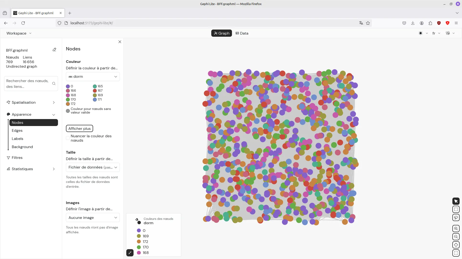
Gephi Lite interface visual identity has been built to stand back and let graphs express themselves: it is neutral. Neutral in its colors, that are designed not to catch the eyes. They are only made of shades of grey and white, which let graphs stand out, full of color, like fireworks at the center of the screen.
Speaking of taking space, spacing and sizing were also generally reduced. It felt necessary when a lot of interviews pointed that sections were sometimes too wide, fuzzy. Components and sections are now more condensed, minimal.
Gephi Lite typeface Poppins (Indian Type Foundry) was also taking a little too much space, indeed it works best on titles. However, Poppins geometric style fit with graphs. So as not to lose this aspect, we have chosen to use DM Sans. Created by Colophon Foundry (UK), it was designed from the Latin portion of Poppins but is more condensed, which was a perfect with our intention.
After the design
This new design has been implemented late June 2025. Implementing here means coding the web interface, but also organizing a design system to guide web integration with design rules. Benoît and Arthur carefully set up a set of SCSS variables to ease using the design rules in our code.
Our nice big plan had to be adjusted here and there as implementation always yields surprises. Working all together in the same room during those days were very fruitful and fun.
Finally, the new Gephi Lite version still needs tests and polishing. We will use the summer to do that. More precisely, we will use the perfect occasion brought by the upcoming Gephi Week in late August to show our current work to participants. Some of them actually took part of our users interviews.
This event will bring our last list of refinements to do before going live. So expect the new release to happen in early autumn 2025.
Welcoming Arthur was a great experience for us. Arthur is now back at university to finish his master thesis. We are thinking about sharing our experience about having a real designer in-house. Stay tuned to learn more about that. Meanwhile we (Alexis, Benoit and Paul) want to say a big and warm THANK-YOU to Arthur for his wonderful help and kindness.
