Some new visualizations for the RICardo project
The RICardo research project seeks to renew our understanding of the trade globalization dynamics by building a data set gathering numerous political entities trade statistics from the 19th and early 20th centuries. Grouping those historical statistics allow to analyse globalization regional effects. It brings a rich view on international trade but also complexity: trade entities aren’t just countries (cities, groups of countries, colonial areas…) and trade flows values differ depending on the sources. Embracing heterogeneity to better understand a complex phenomenon: what a great challenge for visual analysis!
This project has a long history to which we contributed recently through a contract aiming at improve RICardo’s visual exploration website.
In this blog post, we explain the choices we’ve made to enhance complex interpretation through visual analysis.
You can’t grab a data set and slide into a great #DataViz.
Rather, you make one decision at a time with what you have in your toolbox. 🧰🔧⚙️ pic.twitter.com/8qouUNUA0p
— Alli Torban (@AlliTorban) October 27, 2020
RICardo’s website before the mission
The website was created in 2016 to equip the publication of the first version of the data set with an exploration tool. A communication (see the slides) in the Digital Humanities 2016 conference explicits the choices made at that time to provide a progressive exploration of 19th and early 20th centuries international trade.
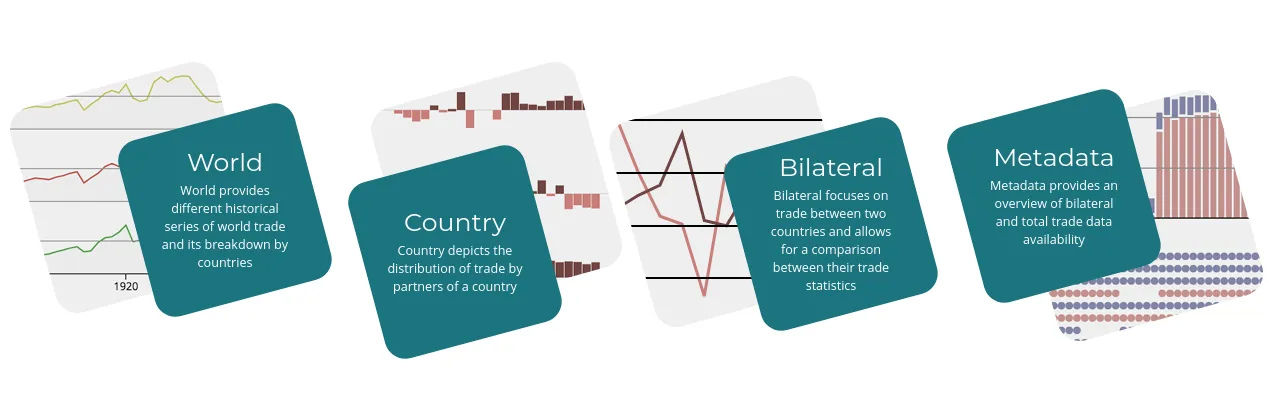
It proposes an aggregated view of trade at the world scale (World page), then a detailed view of one country’s trade (Country page) and, at an even finer level, allows the user to compare a couple of countries to analysis the discrepancies of trade figures found in their respective statistics volumes (bilateral page). An other view has been added later to document the sources used and to visualize the level of completeness of the data set along the period (Metadata page).
This web application was developed with angularJS with D3.js for the visualizations and Python Flask to serve through an API the data stored in a SQLite database (code source).
Which new features?
To help Béatrice Dedinger (principal investigator) to design and prioritize new features, we proposed to use an agile method. In opposition to fixed-price contracts, we agreed on a time based rate and not on the completion of a set of features which would require precise specifications. Agile methods are indeed particularly efficient for projects where we need to design together the best solutions taking into account scientific, technical and usage constraints. Our goal is simple: to bring the best service to users from a fixed budget and a list of ideas as starting points.
We started the project with a design workshop where we discussed each new features ideas coming from Béatrice or from our team. This first step is crucial. Exchanging our points of view on each ideas allow not only a better design but also to reveal how our different cultures (scientific, technical and design) can shape issues differently. This acculturation is a solid rock on which we can later refer when having to deal with unexpected problems.
Once new features are clearer (specifications and difficulty), Béatrice could then give us a priority order. Next steps are “easy”, a weekly meeting to debrief what we could produce in what time to then decide together what to do next (agile iterations).
In this text, we present the main evolutions we brought to RICardo describing the visualization issues we tackled. We will not describe the more technical tasks which were necessary as the update of dependencies or the code packaging system modernization.
Permalinks
A visual exploration web application generates numerous visualizations depending on filtering choices made. Each view (World, Country, Bilateral and metadata) is one visual application of its own which can be used on different objects of the data set (Country view can be used on each entity). Moreover each view proposes filters to reduce the scope to a precise corner of the data (all views can be filtered on a time period). Each view is not just a web page but more something like a web pages generator. It’s the Single page web app model. Nonetheless, users are visiting a website and their actions (choices in views) guide them to visit many different pages.
It’s a good practice to reflect filters/select users actions in the page URL. By doing so both users and their web browsers know now that the content they are looking at is a little different from the previous one (even if they didn’t fetch a new HTML document because of JavaScript side web content rendering).
On top of respecting basic principles of web navigation, changing the URL according to user actions brings native URL benefits:
- web-browser history system
- a unique URL for each view can be used as reference
This last feature is better called permalink and is particularly useful to share visualizations with colleagues or to refer to from scientific communications. Having the data set version would be necessary to have a real permanent link.
It is now possible to refer to 1821-1870 french trade and more precisely to the comparison of its three main trade partners at that time (United Kingdom, United States of America and Belgium) with this URL:
This URL readability isn’t exactly optimal, but it’s the price to pay for being exhaustive!
Exchange rates
To analyse international trade statistics, one needs to compare values expressed by many different sources using their local currencies. We therefore need a common currency in which to express all trade flows. Béatrice gathered exchange rates to pound sterling of around one hundred currencies on the period c.1800-1938.
Although this important exchange rate database was used in RICardo, users couldn’t so far explore the rates values over time. Thus, we added a new view to:
- list all currencies available;
- indicate on which years the exchange rate to pound sterling is known;
- show the inflation/deflation effects the rates might have on converted trade flows values

We opted for small-multiples which create a list of available currencies. Showing all currencies at once answer the first objective above all by adding a filter on currency names.
For each currency we use a curve to indicate the exchange rate value evolution through time which fulfill objectives two and three.
The curve is a good graphic model to represent continuous variable evolution through time. As we chose a small-multiple model we have to cope with a fix height constraint. This is problematic, since curves encode the value of each year by using the height of the point (heatmaps are best regarding this issue, see below).
We can’t use more pixels to represent greater value of rate compared to others. We have to let down the idea to make exchange rate absolute values comparable. Let’s concentrate on our objective: compare internal evolution to detect inflation/deflation effects.
To best represent the rates internal evolutions, we decided to break a classic visualization rule: Y-axis doesn’t start at 0!
In case of monetary stability, stable rates oscillate around a average value which can be very far from 0.

Thus, to best view evolutions even minors, it’s best to adapt the scale locally, i.e. not using one common scale for all curves.
In such a case it’s even more important than usual to indicate the scale boundaries. We does that by indicating systematically Y-axis ticks for the minimum and maximum values of the rate. Those ticks are placed just underneath the currency name title. Thus reading a new currency bloc starts naturally by the currency name and right after the minimal and maximal rates in order to set the reading context the soonest.

And as always, those new visualizations allow discovering incoherent values as the Indian rupee exchange rate in 1828!
GeoPolHist
A new data-set called GeoPolHist was built to consider the political dimensions of the 19th-20th history. It lists all world geopolitical entities and their political dependencies links from 1816 till today. A dedicated visual exploration tool was created for GeoPolHist by Arnaud Pichon at Sciences Po médialab.
Those new data could help contextualize trade history by looking at political trajectories of the trade partners along the 19th-20th centuries. Was this trade entities independent or under the control of another one at this period? On the contrary, was this entity controlling other ones? Why trade of “Two Siciles kingdom” stops in 1860? Etc.
Our mission was to find a way to let RICardo users briefly grasp this political context to encourage them to explore it in details on the GeoPolHist website. We designed a graphical synthesis of one GeoPolHist entity data which could be integrated in the already very dense Country page. This new block contains a link to the full visual exploration in the dedicated website.
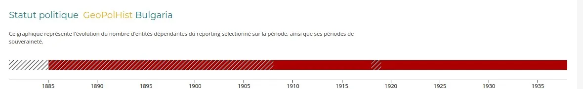
We proposed to add a political timeline for each trade entity showing two main aggregated values:
- sovereignty periods
- number of controlled dependencies over time
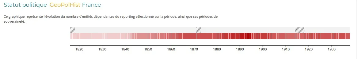
This first prototype uses two stacked timelines: on top, hatch pattern shows the non-sovereignty periods; below, the red opacity depicts the dependencies number. Both timelines reuse the page principles that width encodes time.
For the color heatmap timeline, we created period blocks and not year ones. Indeed, what matter most here are rupture moments and not yearly absolute values. Those blocks represent two variables: dependencies number evolution (opacity variations) and changes frequency (horizontal density of white separators between red blocks).
This set-up fulfills objectives leaving details such as lists of dependencies or sovereign entities, political link types (colony, occupation, annexion…) to the dedicated tool whose link is added in the visualization title.
Problem: entities have very often one of the two bars totally empty because always sovereign or without no dependencies at all. Stacking the two bars therefore waste height in an already very long page. We tried to merge the two timelines into one.
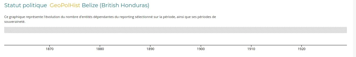
The hatch pattern actually supports overlaying the heat-map! Yes, but the opacity scales from white to dark red. Black hatches would be difficult to read on dark red, white ones on the contrary would be invisible on white backgrounds when there are no dependencies. Expressing the issue this way suggests the solution: a double white/black hatches pattern!
Here is the code of those white/black hatches in SVG using d3.js (see this code in context).
// hatch pattern
const pattern = svg
  .append("defs")
  .append("pattern")
  .attr("id", "diagonalHatch")
  .attr("patternUnits", "userSpaceOnUse")
  .attr("patternTransform", "rotate(45 0 0)")
  .attr("width", 6)
  .attr("height", 6);
pattern
  .append("line")
  .attr("x1", 1)
  .attr("y1", 0)
  .attr("x2", 1)
  .attr("y2", 6)
  .attr("stroke", "#000")
  .attr("stroke-width", 1);
pattern
  .append("line")
  .attr("x1", 2)
  .attr("y1", 0)
  .attr("x2", 2)
  .attr("y2", 6)
  .attr("stroke", "#EEE")
  .attr("stroke-width", 1);
This new political timeline has been added on the two pages focused on one entity (Reporting and Partner) which we created by refactoring the Country page.
Country Reporting et Partner
The country page was created to explore the trade of the so called ‘reporting’ entities. A reporting is an entity whose trade is exhaustively described by a statistical volume, depicting the complete list of trade partners. Some trade entities on the contrary are not described in those volumes but only mentioned as partners. If we stumble upon those entities in some volumes we couldn’t find any sources depicting their trade in a dedicated data table. Those partners couldn’t be represented in the country view which requires exhaustive trade data.
We worked on revealing this so far hidden side of the data-set by creating a new page called Partner, renaming the Country one as Reporting. This new page gathered data collected in reporting statistics to indirectly rebuild the bilateral trade of a Partner entity. This new page idea was inspired by research conducted on those indirect trade views thanks to bilateral data-set (Girard et Dedinger 2018).
We so-to-speak mirrored the Reporting page by adapting it to the specific case of partners. The data we can work with are the traces found in reporting entities statistics depicting a partial reflect of the complete trade of the entity. This reconstructed estimation being incomplete, it implies:
- to remove total trade curves, because we know they are false without being able to estimate incertitude
- to replace share of trade indicator which can’t be calculated, the total being unknown,
- to add a barchart showing the number of reporting entities citing the partner over time to give some insights about the level of completeness of this indirect view.
For the first point, we just had to suppress the total trade visualization. Working on points two and three on the partner page actually implied modifications on the original Reporting page. We added a number of partners barchart (3.), and the new trade partner list visualization (2.) developed for the partner page was finally added back into the Reporting page.
Trade heat-maps
To build the Partner page we had to reinterpret the list of trade partners proposed in the Reporting page with the no share of trade constraint.
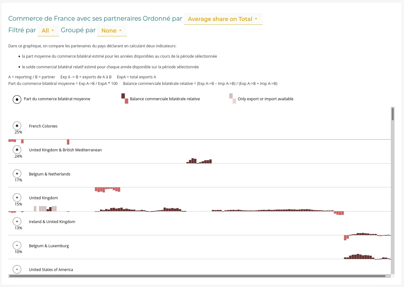
We developed a new visualization keeping the small-multiple principles using heat-maps to represent trade volume. But the issue here is to find a way to represent trade intensity evolution of each reporting while allowing to compare their relative importance for the partner being visualized.
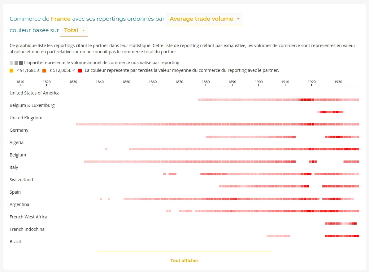
We chose to use a local scale for the heat-map intensity. The trade maximum year has a maximum opacity whatever the absolute value of this maximum. Each line depicts trade evolution of each trade/reporting couples. To add a visual encoding of the differences in absolute trade values, we use an ordinal color scale using terciles to represent the average absolute trade volume. We create three classes of trade volume (small, medium, important) using a progressive color scheme: yellow, orange and red. Moreover, the small multiples can be sorted by descending average trade volume, putting on top of the list the greatest reporting (as trade partners).
Béatrice found this new visualization of trade intensity very expressive. We decided then to reuse this component to rebuild the trade partner list in the reporting page. On top of interpretative gains, porting this visual model back into the original page improves the coherence between those two pages reporting and partner which are the two faces of the bilateral trade mirror.
By doing so, we need to let down the original objective to represent the evolution of the trade balance. This information was difficult to interpret in this small-multiple context. We proposed to use the share of trade metric already used to sort the partners (and which can be calculated in the reporting page). The more a partner trades with the reporting compared to others, the greater the share of trade is, even if this partner only traded in a few years since we don’t count 0 if there is no data.
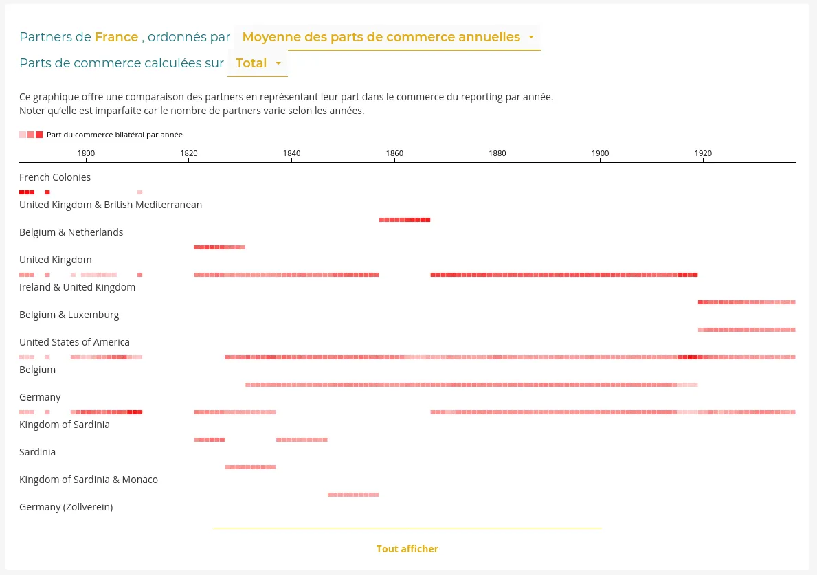
Since we can in this case use total trade figures as a reference and thus calculate shares, it’s also possible to use a global scale to represent trade intensity. Using the same scale for all heat-maps allows comparing opacities between lines and therefore using only one color. Reading is simplified. The drawback is that internal evolution of one partner share of trade is less emphasis. This being said, it’s still readable. The values represented being shares, the scale is limited to 100 values. The heat-map is particularly recommended here.
An interactive data visualization application forms a whole, whose coherence matters. Adding a new page derived will most likely have an impact on the original one. Maintaining a good balance between specificity (global versus local scales) and coherence (small-multiple heat-maps) is an important part to ensure the greatest user experience.
Conclusion
By managing this contract with an agile method we could build a fruitful collaboration, including the design process. An important issue for research projects, notably in digital humanities where complex datasets and a demanding interpretative frame require custom solutions.
We hope this sharing of experience will help other teams in their own project!